Audrey Gheorghe — November 07, 2017
Hinting: typography on a pixel grid
You know it already: on a computer, a picture is made out of pixels. These little squares are laid out together to form an image.
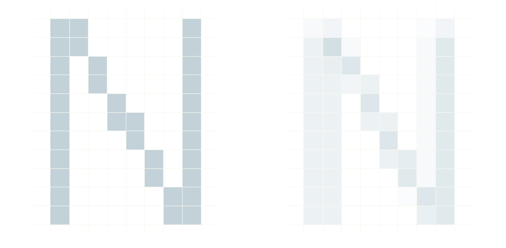
It’s very easy to draw a vertical or an horizontal line. To create these lines you just have to follow the natural alignment of pixels. But it’s more complicated for a tilted line or a curve. The drawing cannot match the natural pixel grid or a stair-like pattern will appear, this is called aliasing.
What is anti-aliasing?
To counter this unattractive pattern, you can use a smoothing process called anti-aliasing. This method uses greyscale gradients to ease the color transition. That way, a black line on a white background will be drawn using different shades of gray: the more the line covers a pixel, the darker it is drawn.
This process produces a slight amount of blur but creates a much smoother drawing.

Aliased and anti-aliased rendering of the letter N
Anti-aliasing and text rendering
Text legibility on a calculator is obviously a major concern. After a comprehensive benchmark, we settled on the Source Code Pro font:
- It is a fixed width font, especially adapted for programming and scientific environments
- It has a strong dimorphism: it is impossible to mix up a capital O with the 0 digit.
The shape of a letter — a glyph — is made out of curves and lines, but these don’t match the pixel grid. We have two options: a jagged display or a blurry one.
Hinting, the smart compromise
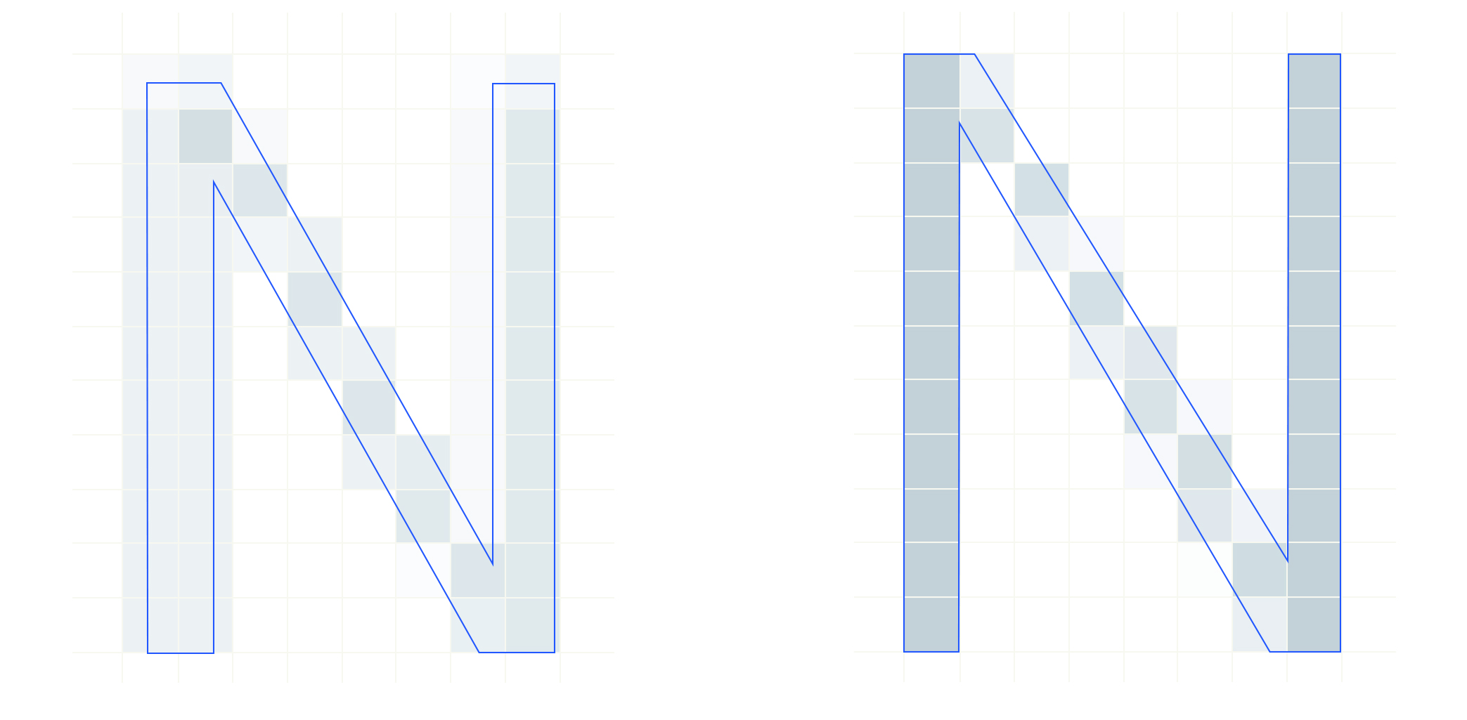
Anti-aliasing is useful, but we can do better. Let’s take the example of a letter with straight edges such as N. If we draw the original Source Code Pro glyph at size 8, the edges of the letter will most likely fall between pixel rows, hence producing a blurry image. But what if we slightly tweaked the glyph shape to make it perfectly fit the pixel grid?

Before and after hinting the font
This is what hinting is all about! This process allows us to change the glyph shape to make it match the pixel grid. Hinting adds a subtle amount of blur when needed (curves and tilted lines) and keeps the contrast in control. That’s why we’ve manually reworked every single glyph used in our calculator this way. The result is optimal text rendering: highly contrasted yet easy on the eye.

Audrey Gheorghe — Art Director
Audrey is our resident creative genius! She has a Master's in Graphic Design and joined our team as Art Director in August 2016. Do you love all the images on our social media channels? Thanks to Audrey, our social media channels look beautiful! She also works on all the visuals included on our calculator! Audrey never really loved math in school but, thanks to the playfulness of the universe, she now spends her time making math symbols look amazing!

